Design Systems☉Carrier
A fresh start for Air

Role
Team
Skills
Overview
As Lead Designer for Air, I helped guide a broader system refresh focused on modernization, consistency, and scale. My work centered on strengthening the system’s foundation, improving parity between design and code, expanding across frameworks, and creating clearer guidance and tooling for adoption.
When I joined Carrier, the design system had evolved into a fragmented mix of MUI components, custom patterns with limited parity between design and implementation, and outdated dependencies that introduced unnecessary complexity. This made the system harder to maintain, harder to scale, and less reliable for teams across design and engineering.
Air was not designed for a single product or audience. It supports a growing ecosystem of commercial and residential experiences across web and mobile, serving everyone from technicians and building managers to dealers and homeowners. That breadth made scalability, flexibility, and alignment especially important.
Foundation Cleanup
Modern components for a more scalable system
To address this, I led a full modernization effort across the system. I audited and rebuilt 76 components to align with current standards, restructured, tagged, and documented them to improve discoverability and handoff, and cut over 600 redundant variants — reducing file memory by 23% in the process. That alone made the system noticeably faster and easier to work in.

76 components aligned to code
A lighter system, built to scale
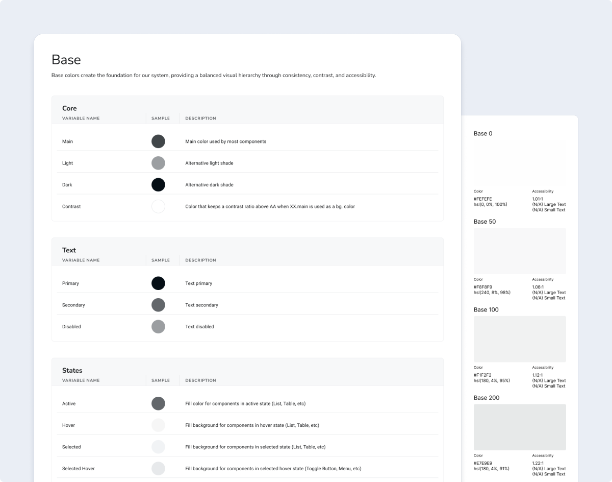
Improved token schema
Some of the most meaningful changes were quieter. The token schema had no base category — nothing anchoring the foundational grayscale colors that everything else depended on: borders, typography, interaction states. Adding that layer gave the system a more stable foundation and made those decisions explicit rather than assumed. I also standardized typography through baseline sizes, cases, and weights, and reworked the token structure to better support accessibility, so contrast and scale were baked in from the start rather than corrected after the fact.
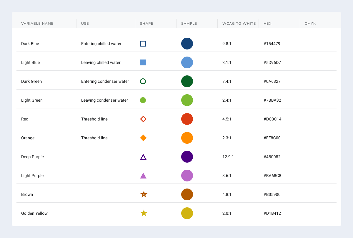
Data-vis was another gap teams had been working around entirely — there were no established colors, which made consistency across charts and dashboards basically impossible. We built out a full set of styles and tokens, and made accessibility a first principle from the start by pairing each color with a distinct shape, so information was never conveyed by color alone.
A stronger system with lasting impact
What started as structural cleanup ended up having a pretty meaningful ripple effect. The result was a faster, leaner system that improved consistency, reduced technical debt, and gave teams clearer implementation guidance. By simplifying component structures and improving documentation, we made the system easier to adopt, easier to maintain, and more reliable across both design and development workflows.
Design-to-Code Parity
Bringing design and implementation closer together
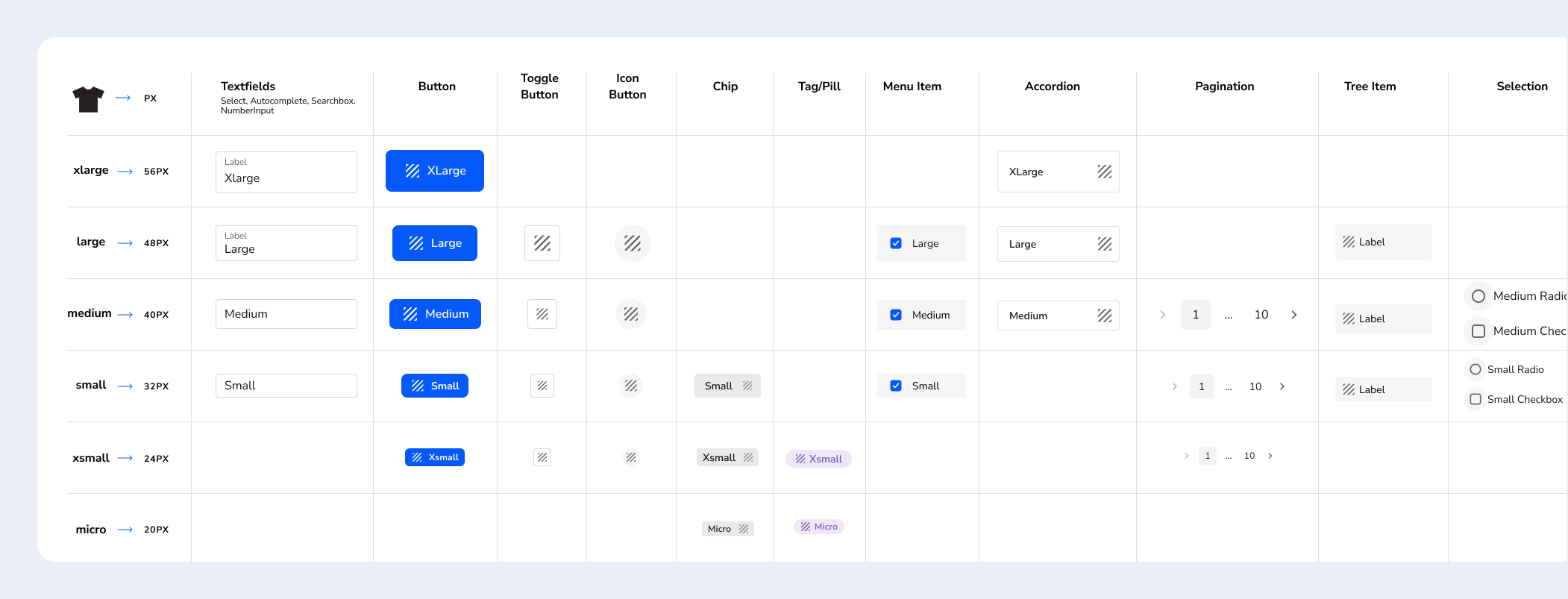
With a stronger foundation in place, the next step was making the system more predictable in practice. I partnered closely with engineering to clarify component behavior, states, and naming conventions so they were more implementation-ready and easier to translate into code. I also standardized sizing across the library, introducing t-shirt sizes mapped to 4px increments to resolve inconsistency and improve how components fit together inline. To close the gap further, I made targeted updates to the React components myself, submitting pull requests in Bitbucket to improve parity, resolve inconsistencies, and strengthen the shared system.
Unified sizing across 38 components
24 React PRs merged
Flexibility without detaching
We introduced Placeholder Slot components where appropriate to mirror the flexibility already supported in the React implementation, allowing designers to handle custom content and edge cases through Instance Swapping without detaching the parent component or pattern.

Making handoff more legible
One of the more persistent problems was what happened outside the core system. Product teams were building their own components to fill gaps, but there was no consistent way to document them — which meant engineers had no reliable way to know what they were looking at during handoff. Was it a base Air component? Something custom-built on top of it? A one-off solution that only lived in one product? The answer usually required asking someone.
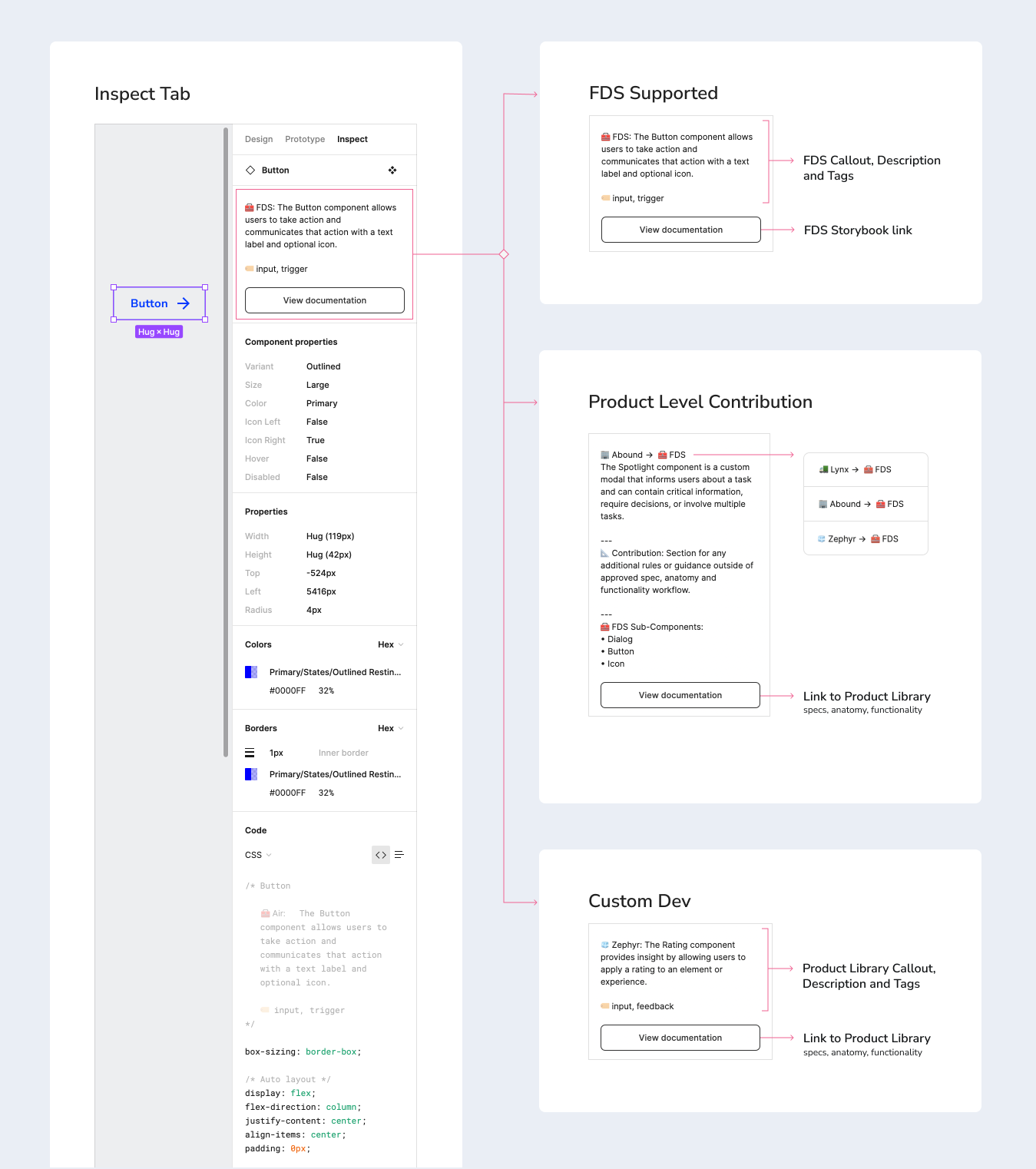
To fix this, I developed an annotation model built directly into the Figma inspect panel — the layer engineers are already working in during handoff. Components were tagged and described according to a clear taxonomy: base Air components, product-level components built from Air primitives, and fully custom solutions. That distinction, surfaced right in the inspect tab, meant engineers could immediately understand the provenance of any component without leaving Figma or chasing down a designer.
Coached 3 product teams (Abound, Zephyr, and Lynx)
Reached 40+ designers, PMs, and engineers
But the system only worked if product teams adopted it consistently. I coached three teams — Abound, Zephyr, and Lynx — on how to apply the model in their own libraries, which also pushed designers to think more systematically about their edge cases: what warranted a product-level component, what should be contributed back to Air, and what was truly custom. The enablement sessions around Figma Dev Mode tied it together — giving engineers the confidence to navigate the inspect panel fluently and giving designers a shared language for documenting their decisions.
Framework Expansion
Extending Air across platforms
As the system expands, so does the need for stronger alignment across platforms. We are collaborating with the Residential team to align the React Native library with Air and strengthen consistency between web and mobile experiences.
That work includes aligning token structure and component behaviors where possible, onboarding new products, and improving Figma’s variable schema to better support advanced theming. At the same time, I’m working closely with engineering to help shape the right strategy for moving the React Native codebase out of its current monorepo and into a more scalable foundation.
Shared guidance and governance
How we stopped reinventing and started sharing
While Air was maturing in design and code, it lacked a third critical pillar: documentation that could support users at multiple levels of technical depth. Without a centralized source of truth, designers relied on scattered files, engineers lacked consistent implementation guidance, and teams often recreated patterns or interpreted standards differently.

Co-creating our design standards
As adoption grew, it became clear that the system needed more than components and code — it needed shared guidance that could align teams around how the system should be used, extended, and maintained.
To meet that need, I partnered closely with design and engineering to build a more comprehensive guidance model that documented component behaviors, usage patterns, states, tokens, and best practices in a way that supported both day-to-day adoption and longer-term system governance.
Guidance in practice
Component demos helped translate documentation into something more immediate and usable for both designers and developers.
A shared language across teams
What emerged was more than documentation. It was a shared design language that transformed how Carrier's design teams worked. New designers could onboard in days instead of weeks. Teams started contributing back to the system, proposing improvements based on their usage. Most importantly, designers across Carrier began seeing Air not as a constraint, but as a foundation that let them focus on solving the problems that really mattered.
Scaled adoption through tooling and AI
A connected ecosystem for adoption at scale
I also helped establish a connected workflow around Air that linked design, engineering, documentation, and QA into a more unified system. Figma supported component design and prototyping, Storybook and Bitbucket strengthened implementation and collaboration, Supernova centralized tokens and standards, and Chromatic helped catch visual regressions before release.

Tools to unlock efficiency
To support adoption at scale, I also built a series of custom Figma plugins that reduced repetitive work, improved consistency, and filled workflow gaps that Figma did not natively solve.
Connecting Air to Figma Make
Beyond plugins and connected workflows, I built a direct integration between Air and Figma Make — grounding AI-generated prototypes in Air's actual components, styles, and implementation patterns.
A rebrand and a reset
As Air evolved, the rebrand from Fleet created a natural moment to bring a broader set of system improvements into a more cohesive 2.0 release. I used that opportunity to refine the system through clearer property naming, more scalable sizing conventions, and component demos that improved usability and handoff.

Built to scale
Air 2.0 marked a step forward not just in identity, but in how the system supported day-to-day adoption. Clearer standards, more consistent workflows, better onboarding support, and stronger guidance made it easier for designers and developers to understand, apply, and scale Air across their work.
Related case studies
Data that fits in your hand
I designed a responsive table-to-tile DataGrid that made complex data easier to use on mobile while replacing a costly third-party tool.
Connecting Air to Figma Make
Beyond plugins and connected workflows, I built a direct integration between Air and Figma Make — grounding AI-generated prototypes in Air's actual components, styles, and implementation patterns.