Design Systems☉Bayer
The single source of truth powering Bayer's product teams.
Role
Team
Skills
New System
Pixel-perfect and code-ready
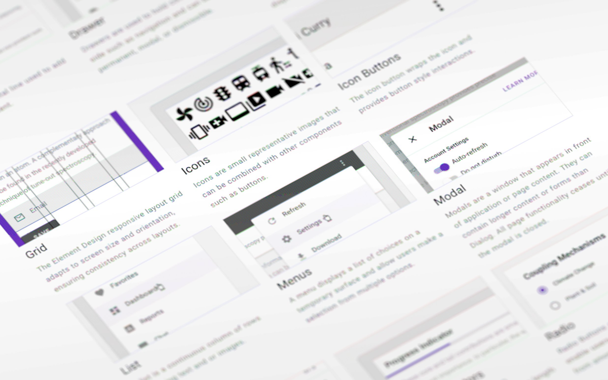
Over an 18-month period at Bayer, I collaborated with product owners, designers, engineers, user researchers, and cross-functional partners to unify and enhance the company’s design system, Element. Together, we expanded the system to include over 35 production-ready components, enabling teams across the organization to build more consistent, accessible, and efficient digital experiences.

Leveraging atomic and human-centered design principles, I helped build interactive components, variants, and AA-compliant themes in Figma. This work involved close collaboration with engineers to QA each component and ensure the React and Vue code libraries maintained 1:1 parity with the design kit.
Scalable Documentation
Clear guidance for every component
To support consistency and accelerate adoption of our design system, I wrote thorough documentation and best practices for core components, styles, and UI patterns. This included guidance around states, variants, placement, and usage—all paired with real-world examples. These resources helped teams understand how and when to use each component, reducing ambiguity and handoff friction between design and development.

By investing in clear, scalable documentation, we empowered product teams to make informed decisions, improved design-to-code alignment, and enabled faster onboarding for new designers across multiple brands and business units.
Figma Migration
From Sketch to scale
Following Bayer’s transition to Figma, I supported teams in migrating their designs and product-level libraries from the previous Sketch and Abstract ecosystem. To aid in the transition, we documented our build process and improved the contribution model to consistently gather feedback and evolve the system collaboratively.

Component Tagging
Better browsing for busy teams
With so many teams managing multiple brands and product-level libraries, locating the right component or icon can be a frustrating experience. To help designers with their search, we tagged a handful of our base components and added variant descriptions.
