Air Design System
Creating with speed, confidence, and scale across Carrier.
Role
Design LeadTeam
7 MembersFrameworks
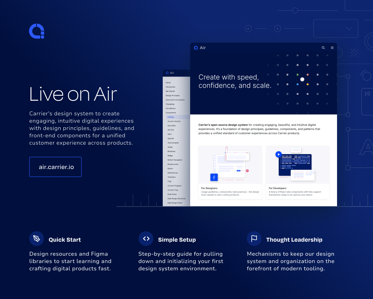
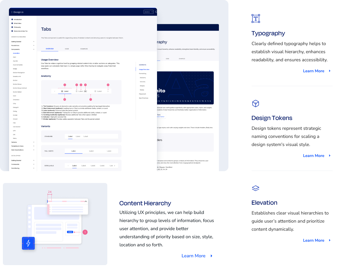
React, React Native, and QTDuring my time at Carrier, I led the evolution of the Air Design System, scaling it into a unified, enterprise-ready platform supporting 14 products, 120+ components, and three frameworks. My work spanned everything from major library cleanup and a 2.0 release, to launching a documentation site and developing custom Figma plugins that automated workflows and boosted efficiency. I also expanded Air into new frameworks like React Native and QT, ensuring design consistency across platforms and unlocking cohesive experiences for designers, developers, and end users.
Confronting complexity
A fresh start for Air
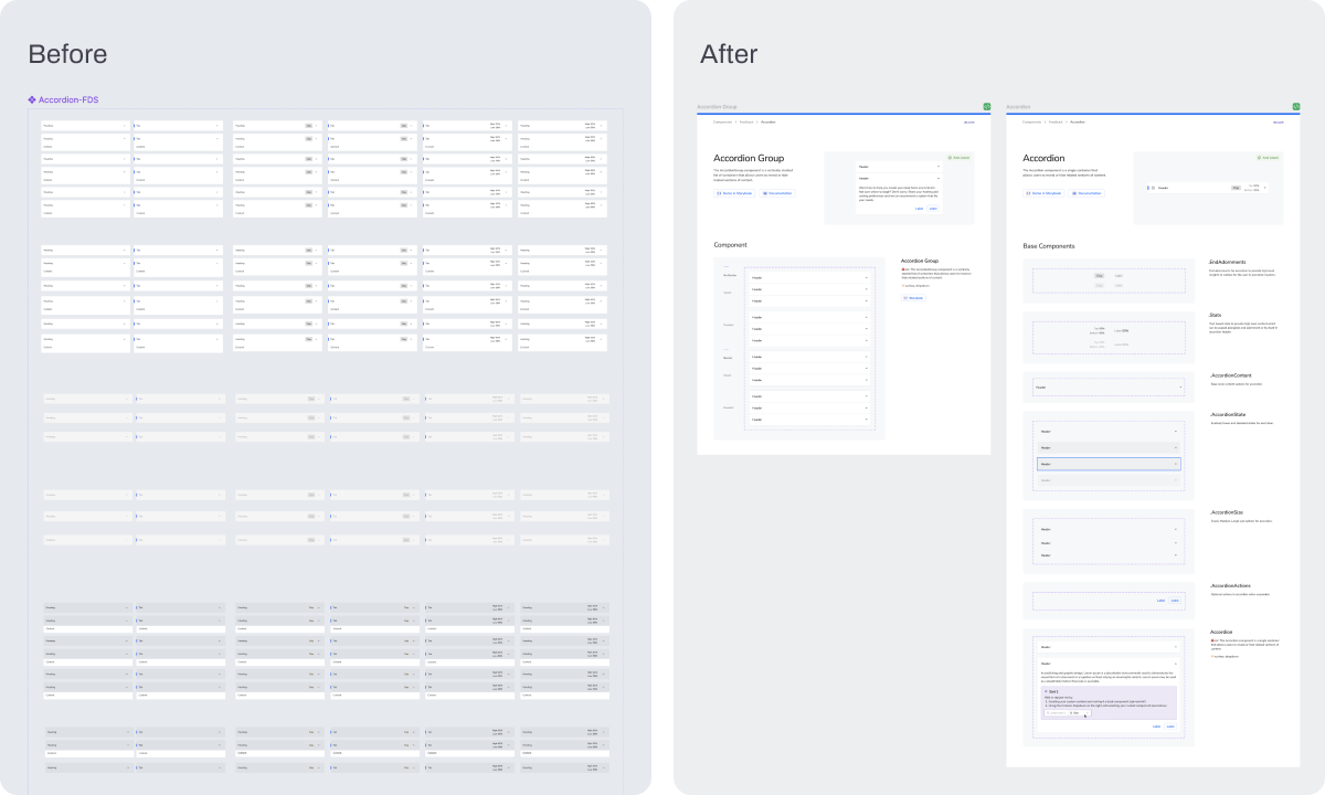
When I first joined Carrier, one of the biggest challenges was that the design system had become bloated and inconsistent. Designers struggled to navigate libraries and locate components, engineers faced unnecessary complexity, and outdated variants were slowing everyone down.
Modern components for efficient libraries
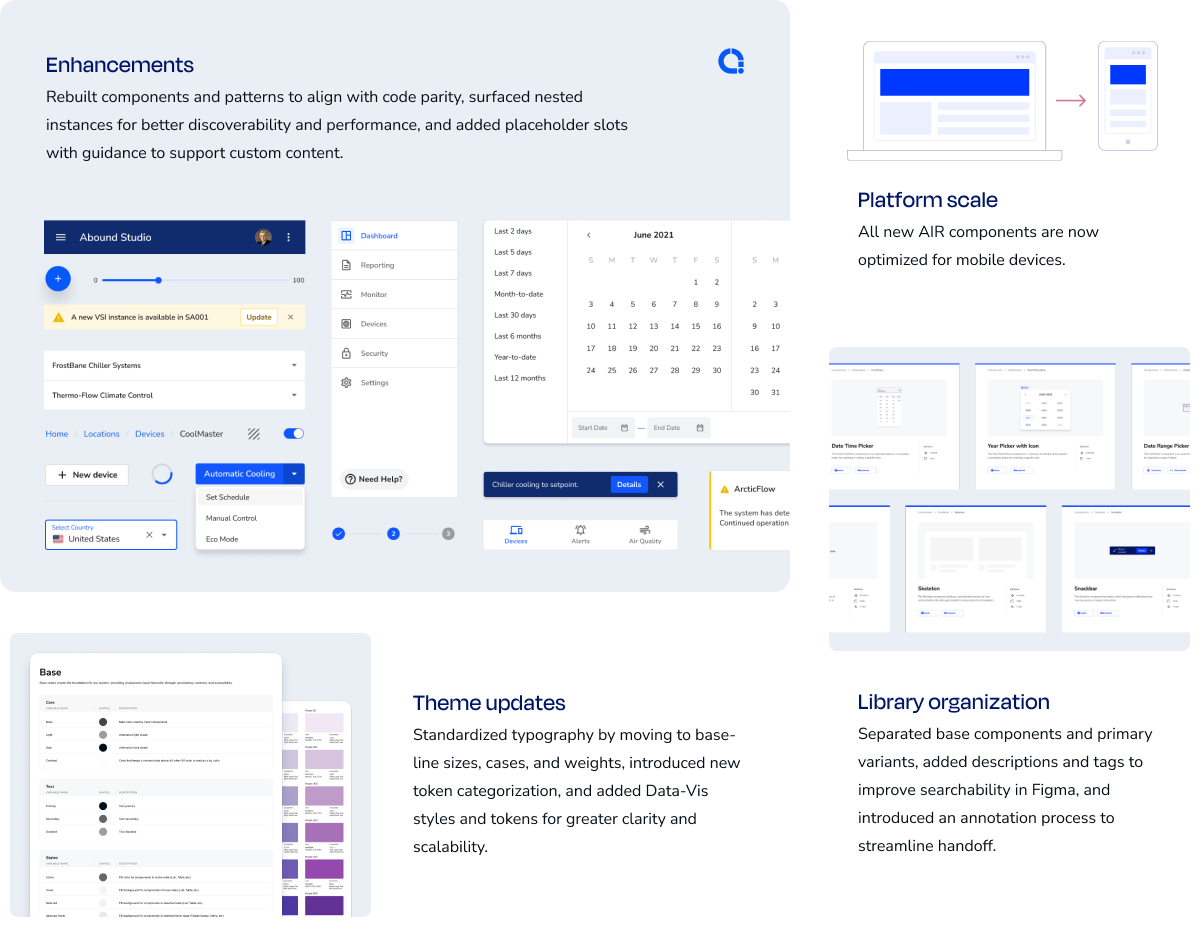
To tackle this, I led a comprehensive cleanup of the library, starting with identifying and rebuilding outdated components to align with current design standards. I then ran rigorous QA to ensure visual and functional parity, deprecated redundant libraries, enriched component metadata to improve searchability and usability within Figma, and documented the variants, colors, and states for each parent and nested component to provide clear guidance for teams.
Flexibility without detaching
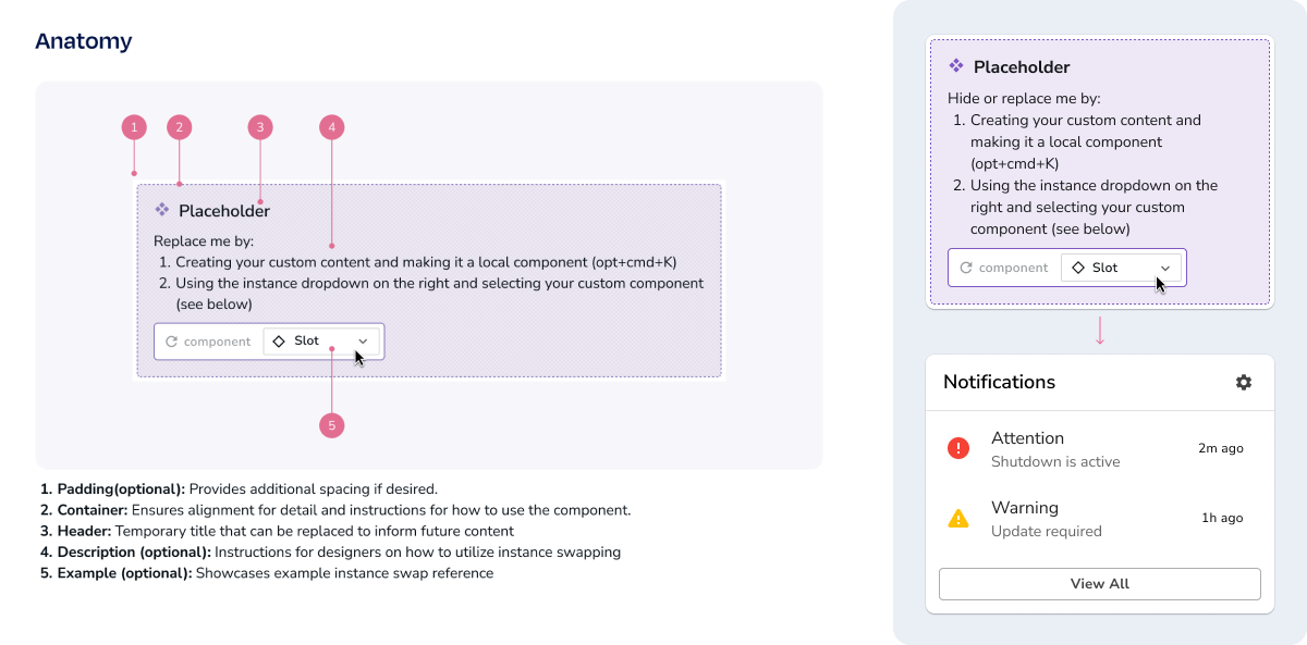
We also built in Placeholder Slot components where applicable to support custom content and edge cases through Instance Swapping, giving designers greater flexibility while avoiding detaching the parent component or pattern.
A strong first step
The result was a faster, leaner design system that improved consistency, reduced technical debt, and gave teams clearer guidance. By modernizing with Figma’s latest capabilities, we cut down variant sets and memory usage while unlocking new levels of efficiency and confidence across projects.
Table to Tile
Data that fits in your hand
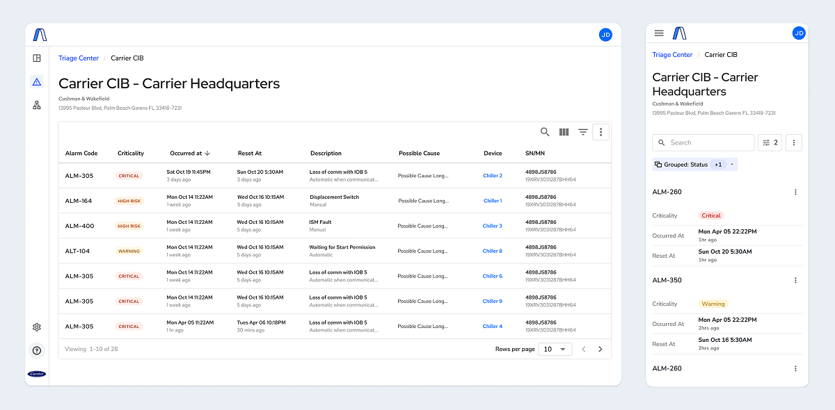
Products across Carrier relied heavily on a third-party Table component (AgGrid) to display critical information like device listings, user permissions, and alarm codes. While AgGrid supported robust filtering and grouping on desktop, it fell short on mobile—forcing users, such as AHP technicians, to scroll horizontally just to access data. Beyond the usability gap, AgGrid also carried a high cost since each developer required an individual license.
Balancing design flexibility and engineering setup
Before landing on a final approach, we explored a number of responsive table solutions to improve usability on smaller screens. We compared patterns that introduced horizontal scrolling, column prioritization, and condensed layouts, but each came with tradeoffs in readability and implementation effort.
In parallel, we tested tagging strategies to give designers greater control over how data was surfaced and grouped. While these explorations offered powerful customization, they also increased engineering complexity and setup effort during implementation.
A new DataGrid
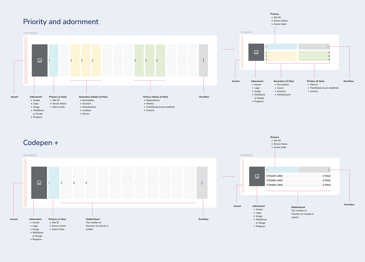
Our solution was to design a Carrier-owned DataGrid pattern tailored to our products’ needs. Instead of forcing a rigid table onto smaller screens, the pattern adapts content into vertically stacked tiles that function more like a list view. Each tile surfaces the most important columns at a glance while providing access to the full dataset through an expandable overflow drawer. We also embedded native search and sorting functionality, and are actively developing filtering and grouping to ensure parity with desktop workflows.
The new Table-to-Tile DataGrid significantly improves the mobile experience for technicians and other on-the-go users while reducing licensing costs. By making large datasets easier to scan, navigate, and adapt, the pattern enhances efficiency in the field and establishes a scalable, Carrier-owned alternative to third-party solutions.
Custom Plugins
A little code, a lot less friction
While I didn’t set out to create a full library of plugins, I built each one to solve a specific pain point. Designers were losing time on repetitive manual tasks—like deprecating outdated components, setting up complex Data-Vis canvases, or maintaining consistent file structures. These gaps created friction in daily work and introduced inconsistencies across the system, which made it clear that small, targeted tools could make a big difference.
To address this, I developed plugins purpose-built for these needs.
Setpoint
Setpoint transforms chart building from a slow, error-prone process into rapid, consistent exploration that frees designers to focus on storytelling.
Structure
Structure provided a fast way to scaffold files and enforce consistent page setups across the system.
Sunset
Sunset streamlined the deprecation process by allowing bulk removal and replacement of outdated components, keeping libraries current with minimal effort.
Immediate impact
Each plugin was lightweight, task-specific, and designed to integrate naturally into existing workflows. The impact was immediate: repetitive manual work dropped, teams adopted updates more quickly, and designers could focus on solving problems rather than managing files. The plugins not only boosted efficiency and improved Figma performance on large-scale projects, but also reinforced system standards by embedding them directly into daily design practice. Just as importantly, building these tools sparked broader discussions across the team and generated new ideas for future plugins, laying the groundwork for continued streamlining and automation.
Air 2.0
More than just a rebrand
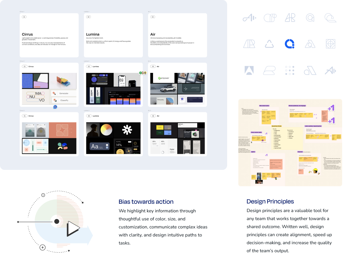
I’d been quietly building a backlog of critical fixes — standardizing property names, implementing t-shirt sizing, creating component demos, and defining clear design principles. When the decision came to rebrand from Fleet to Air, it became the perfect moment to package all these improvements into one cohesive release.
Guided by design
I led the 2.0 launch, using the rebrand as momentum to address fundamental inconsistencies while giving the system a fresh identity. We unified property naming, implemented scalable sizing standards, and built interactive Figma demos that showed teams exactly how to use each component. The rebrand eliminated confusion with other internal projects and signaled that this was a more mature, trusted foundation.
The release transformed how teams worked with the system. Designers and developers gained standardized workflows and clearer guidance, while the component demos became essential onboarding tools. Air finally had both the technical foundation and brand identity it needed to scale across Carrier’s ecosystem.
